Warwickshire Police: Royal Succession Brand Update

Brief

A Strategic Visual Identity Refresh

Warwickshire Police required an updated visual identity following the succession of King Charles III, as royal symbols across UK police forces needed to change. Energy Cell transformed this mandatory update into an opportunity for comprehensive brand improvement. Our team was tasked with meeting several critical objectives:

  • Incorporate the New Royal Cypher and Tudor Crown, aligning with Cabinet Office “Symbols of State” guidelines
  • Enhance visual accessibility and readability across all applications and platforms
  • Develop comprehensive brand guidelines for consistent implementation across all touchpoints

Learn more about our services

Incorporating Royal Symbols

Our first task was to properly integrate the new Royal Cypher and Tudor Crown into Warwickshire Police’s visual identity. This required precise adherence to the Cabinet Office’s “Symbols of State” guidelines while maintaining the force’s distinct character.

We studied the official specifications in detail, noting exact proportions, spacing requirements, and proper usage contexts. Working with vector formats allowed us to create pixel-perfect implementations that would scale appropriately across all applications.

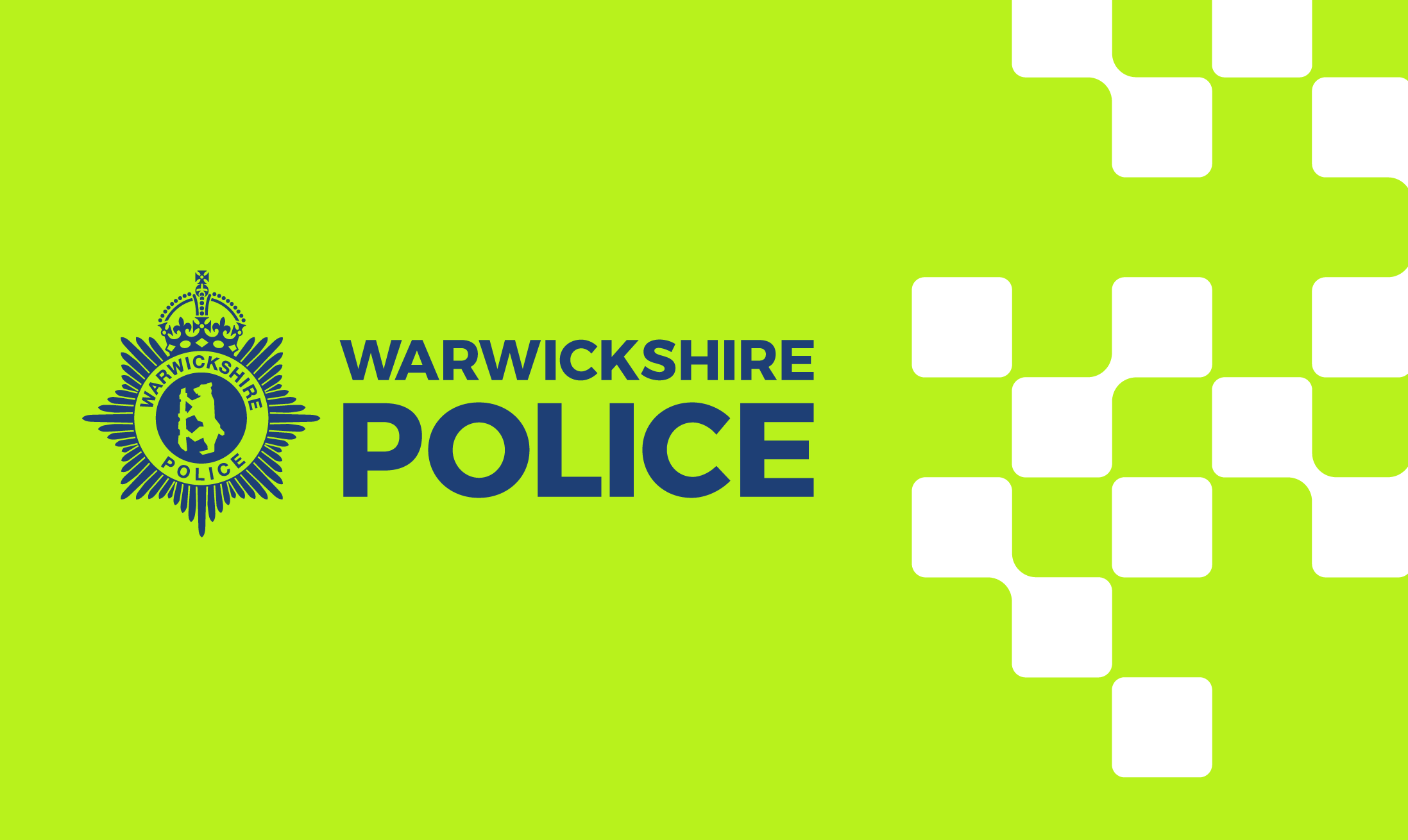
The integration maintained balanced visual weight between the royal elements and Warwickshire Police’s existing symbolism. This careful approach ensured the updated crest remained instantly recognisable while clearly signaling the royal transition. The result gives Warwickshire Police a crest that fulfills all official requirements while maintaining its connection to local heritage and authority.

Improving the Visual Accessibility of Warwickshire Police's Brand Elements

The previous design presented challenges in certain applications, particularly at smaller sizes and across digital platforms.

We analysed the existing visual identity through an accessibility lens, identifying specific issues with line weights, contrast ratios, and detail complexity. By increasing minimum stroke widths and optimizing the spacing between elements, we ensured the crest remained clear and identifiable even at reduced sizes.

Color contrast was carefully calibrated to meet WCAG 2.1 AA standards, ensuring that text and symbols maintained sufficient visibility against various backgrounds. We tested the designs across multiple media, from printed materials to digital screens and embroidered uniforms, making subtle adjustments to maintain consistency and legibility throughout.

The refined design significantly improved recognition for people with visual impairments while enhancing overall brand clarity for all audiences. 

"This project was all about finding that sweet spot between tradition and functionality. We had to be meticulous with the royal symbols while making sure everything worked across digital and physical environments. The real satisfaction came from seeing how our accessibility improvements made the identity more effective for everyone. That's good design – respecting heritage while solving real problems."
Andy Bruton
Graphic Designer

Establishing Brand Consistency

We develop comprehensive brand guidelines that would ensure consistent implementation of Warwickshire Police’s refreshed identity across all touchpoints.

For this, a detailed brand standards manual was created, documenting precise usage specifications for the new crest and associated elements. This included clear guidance on minimum size requirements, protected space, colour applications, and positioning across various media.

The guidelines covered practical applications for diverse contexts: vehicle livery, uniforms, building signage, stationery, digital platforms, and social media profiles. Each application received specific instructions with technical specifications to avoid inconsistencies.

We also included a section on improper usage, illustrating common mistakes to avoid. This helps protect the integrity of the brand while providing clarity for internal teams and external suppliers who might work with the assets.

The final document serves as both a practical reference and educational tool, allowing Warwickshire Police to maintain brand consistency independently going forward. This systematic approach ensures their visual identity will remain cohesive and professional across all public-facing communications.


The Result

Delivering Professional Brand Consistency

The brand refresh for Warwickshire Police successfully achieved all project objectives, creating a unified visual identity that works effectively across all applications. The updated crest and logo now properly incorporate the Tudor Crown and Royal Cypher, meeting all Cabinet Office requirements while maintaining the force’s distinct identity.

Feedback from Warwickshire Police highlighted the improved clarity and professionalism of the refreshed identity. The accessibility enhancements ensure their visual brand remains recognisable and legible across varied platforms, from digital interfaces to physical uniforms and vehicles.

The comprehensive brand guidelines now serve as a valuable resource for maintaining consistency across departments and with external partners. This structured approach to brand management helps Warwickshire Police present a cohesive, authoritative image to the public they serve.

View More Projects.