
Brief
A Comprehensive Rebrand for a Premium Glass Packaging Specialist
Energy Cell was asked to undertake a complete rebrand for Pattesons Glass, a specialist supplier of glass packaging solutions to the food, drink and cosmetic industries. The company needed to refresh their brand identity and improve their visual communication across all platforms to better reflect their premium products and industry expertise.
The project focused on four key objectives:
- Modernise the brand identity to better reflect Pattesons Glass’ expertise and premium product range while maintaining brand recognition in the packaging industry
- Create consistent visual communication across all customer touchpoints including print materials, digital platforms and sales collateral
- Develop a user-friendly website that clearly showcases product categories and helps customers find the right glass packaging solutions for their specific needs
- Produce high-quality visual assets that highlight the craftsmanship and aesthetic appeal of Pattesons’ glass products for marketing purposes
Modernising the brand identity for stronger market positioning
The first challenge was to refresh Pattesons Glass’ brand identity to better represent their position as industry experts while maintaining their established recognition in the packaging sector.
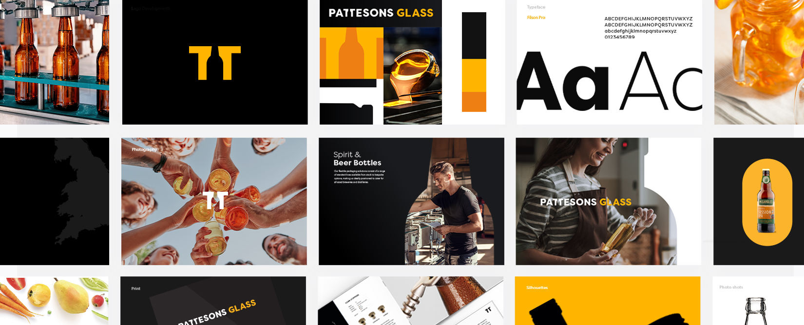
Through market analysis and client consultation, Energy Cell developed a refined visual identity that communicates the premium nature of their glass products. The updated logo and colour palette reflect both the clarity of glass and the precision of Pattesons’ manufacturing processes.
The new brand identity achieves the perfect balance: contemporary enough to attract new clients in the cosmetic and premium food sectors, while retaining familiar elements that existing customers associate with reliability and quality.
Creating Consistent Visual Communication to Build Brand Recognition
Building a cohesive brand presence for Pattesons Glass across every customer interaction was essential for strengthening their market position.
Energy Cell designed and produced a suite of marketing materials including business cards, brochures, exhibition stands, and product catalogues that share consistent design elements. This unified approach extends to digital platforms, ensuring customers receive the same quality experience whether viewing products online or in print.
The consistent visual language helps Pattesons Glass communicate their expertise and attention to detail effectively. Clients can now easily recognise the brand’s distinctive style across various channels, strengthening brand recall and professional reputation in the competitive packaging market.
Developing a User-Friendly Website to Showcase Product Range
The website redesign focused on creating an intuitive digital platform that effectively highlights Pattesons Glass’ extensive product offering.
Energy Cell structured the site with clear product categories and intuitive navigation, making it simple for customers to find the right glass packaging solutions for their specific needs. The design balances visual appeal with functionality, using high-quality product photography to showcase the details and quality of each glass item.
The improved website now serves as both a product catalogue and a powerful sales tool. Potential clients can quickly understand Pattesons’ capabilities and product range, leading to more qualified enquiries and streamlined customer conversations about specific packaging requirements.
Producing High-Quality Visual Assets to Highlight Product Craftsmanship
Professional photography and video production were critical to effectively communicate the quality and detail of Pattesons Glass’ products.
Energy Cell coordinated photography sessions that captured the clarity, finish and precise details of their glass packaging range. Each product was photographed from multiple angles with careful lighting to showcase transparency, colour and distinctive design features that set Pattesons apart from competitors.
These premium visual assets now provide Pattesons with versatile marketing materials that can be used across digital platforms, print catalogues and sales presentations. The professional imagery helps customers appreciate the craftsmanship and quality of the products before making purchase decisions, supporting sales conversations and building confidence in the Pattesons brand.
The Result
Driving Business Growth Through Strategic Visual Identity
The comprehensive rebrand has significantly strengthened Pattesons Glass’ position in the premium packaging market. Their refreshed brand identity and consistent visual communication have created a more professional and cohesive market presence that accurately reflects the quality of their products.
The new website has improved the customer experience, making it easier for potential clients to find and select appropriate glass packaging solutions. This has led to an increase in qualified enquiries and more productive initial conversations with prospects.
The professional photography and marketing materials have become valuable assets for the sales team, helping them to effectively communicate product benefits and quality, ultimately supporting conversion from enquiry to purchase.
View More Projects.
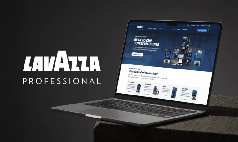
Lavazza Professional
Website Design & Development | Multi-Country Platform Architecture | WordPress Custom Implementation
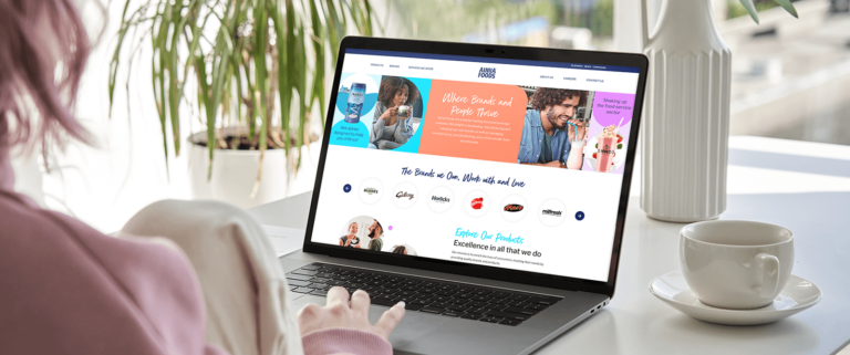
Aimia Foods
Website Redesign | Marketing Platform | Software Solutions | Brand Design
